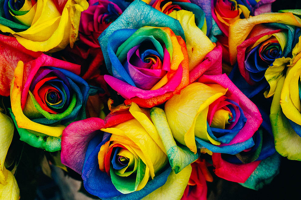
The colors combined by the artist to create the shades are the color palette. These colors are almost always bought in tubes or cans.
The most famous materials for painting are oils, acrylics, watercolors, tempera and inks.The dye, the substance that determines the color is almost always the same. Its quantity determines the price and quality of the material.
So, if we have the ingredient for a blue color (lapis lazuli powder in the past, an artificial ingredient currently) and mix this powder with paprika oil, we will produce oil color. If the same powder is mixed with a synthetic material we will have acrylic color, watercolor with honey and Arabic gum, etc.
When studying the entire work of a painter, we see a color consistency. Typically, the painters, after experimentations, follow a specific palette. If someone imitates a work as an exercise, he/she must first understand the methodology and the colors of the creator and then the brushing and its character (the light and the shadows create the shapes and bring life to the two-dimensional work).
The whole trick in painting is to decode the color. Afterwards, you can choose realistic or subtle topics, depending on your taste. The important, though, I think, is to understand the color and its depth. There are surely the general rules that define in words the colors of each shadow, the light, any surface.
The interesting part is when you start to understand it differently. I think the right expression is to decode it. When you understand this, any color you see can be reproduced easily, automatically. You don’t think “should I add this or the other one?” you just mix them.
My palette
I remember when I was in high school and I was collecting some money, I went with my friend Tasos at a shop in Maroussi to buy materials (the shop is still there!!). I was always confused by the plethora of choices. The colors on the stand were countless and you did not know which one to choose. After high school, along with my graphic design studies, I started painting lessons. There, we were taught the basic rules and so my color palette was limited. Again, however, there were enough choices and in order to achieve a difficult shade I had to ask.
Likewise in Hagiography, I was never sure what happens when materials are mixed.
This was something that has troubled me for many years and so I focused mainly on monochrome sketches and works with charcoal and ink.
In the following years I organized my own creative office and a great deal of important works came out of my atelier. Marquees for theaters, packaging of well-known products, covers for magazines, cd, printed material, etc
In significant works I watched the entire printing process to check the final result. I understood the offset machines - I had also attended photolithography courses and had editing experience – and I was influenced by their operational methodology.
Quite simply and briefly, I will mention the logic of printing. The photos, the printed material, anything printed you hold in your hands are pretty much made in the same way.
A color photo can be divided into 4 colors. Any photo, either it depicts a human or a chair, can be analyzed in four colors. These colors are: light blue, magenta, yellow and black (cmyk). The beauty of it lies in the fact that when one color gets on top of the other, in the proper quantity all other colors are created. That is, if you add small quantities of blue, magenta and yellow, you can have olive green. The same colors in another proportion create the deep blue of the sky. In another analogy (the same colors always) the color of the skin can be achieved.
Based on this logic, after several experimentations, I have concluded that with ultramarine, alizarin crimson, light yellow, as well as white and burnt umber (brown) complementary, all shades can be created. Taking care so that no color remains as it is from the tube and that all shades coexist more or less, a color unity is achieved.
The nice thing is that the combination of these colors is feasible with all materials, because, as we have said at first, since they have the same basic ingredient they work in the same way.
I have noticed that after a few years you understand the color more deeply and you do not have to deal with the rules anymore, but interpret what you see. When I say “interpret” I mean you understand that the dark brown color of a sofa contains brown, blue, a bit of red and a bit of yellow. In the shadows, the same colors exist but more blue and red is needed, while in the light the yellow color is used in larger quantities.
When you will have understood the colors, you can then remove them from the form and simplify the patterns by giving the volume through color, rather than shapes.
It is a continuous and beautiful progression for every creator.


